Hey Everyone,
My name is Bruno, I am the Lead Designer/Illustrator @ Fission (the hand behind Toucan Sam illustrations as well) and I come with a bit of news:
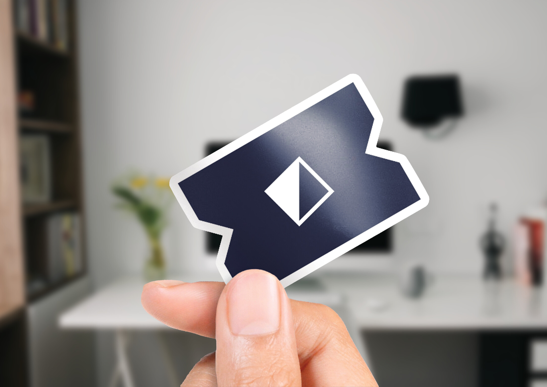
UCAN is ready for its own icon to complement our beloved Toucan, and we need your help! A great icon will boost recognizability, simplify diagrams, and help us build broader support for the protocol.
We’ve got two options, both inspired by the ‘ticket’ metaphor central to UCAN authorization. The first is a solid ticket shape, bold and distinct. The second is an outlined ticket, stylishly distinct with a broken line style. Both designs feature an interior diamond mark to distinguish the “UCAN” ticket from other bearer tokens or OCAP protocols.
Attached is a presentation with these options. Here’s how you can help:
- Review the Attached Presentation: Check out the options and their potential uses, and how they relate to our mascots and the ‘ticket’ symbol.
- Try Drawing Them: Sketch both icons as if you were drawing a network diagram.
- Share Your Thoughts: How was the drawing experience? Any challenges? Are there other icon applications you’d like to see mocked up?
- Choose a Favorite: Let us know your preference.
Thanks in advance for your time and thoughts!
PDF: UCAN Community Presentation.pdf (4.4 MB)