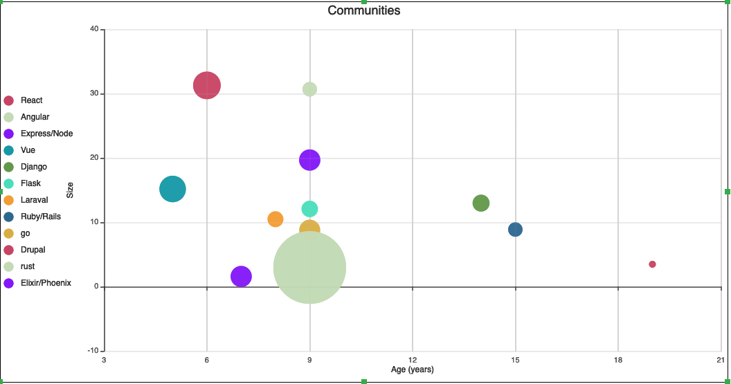
Based on the Stack Overflow Developer Survey I wanted to take a look at the relative size, age and love that each community has.
Disclaimer: The methodology is not rigorous and the data is a bit dirty
So over lunch I created this spreadsheet and graph.
Source data
Note: That the size of each bubble relates to the “Affinity” of a framework / language.
Which is the percentage that love it divided by the percentage that hate it.